The filming process was much longer than last year as we
filmed for five days, we experienced different types of filming runs, Like the bad
shoot day where everything was going wrong, the annoying shoot where we had to
shoot the same scene for hours and on the last day the good shoot day where we
got everything we planned to film right first time. Something that was also different to me this
year was the style of filming , last year everyone was in the project so I got
to film one part and then if I had a scene, we rotated, this year it seems like
everybody had set roles, which is similar to how they work on bigger
production or in films or music videos. I found it difficult working in a set
role position on this shoot because we were limited by the equipment we could use and things we
could do because we only had a small production. emotions ran high throughout filming, the one emotion shared by all was relief when we got all of our shots filmed on the last day.
Thursday, 20 November 2014
evaluation question:4 plan
Technologies used…
Planning and Research:
- Slides
- time toast
- emaze
- powtoon
- thing link
- prize
- animoto
- gifs
- finial cut pro
- camtasia
evaluation question:1 plan
When making our music video we attempted to follow conventions used in Pop videos as that was the genre of our song.
To answer this question I will use camtasia to show a comparison of my video with another video of the same genre; I plan to also use thing link to annotate some of my shots and show how they follow the theories of Andrew Goodwin.
- we used obvious edits
- a range of close-ups and medium shots
- we tried to follow andrew goodwins theory (base track editing)
- use a range of costume changes
To answer this question I will use camtasia to show a comparison of my video with another video of the same genre; I plan to also use thing link to annotate some of my shots and show how they follow the theories of Andrew Goodwin.
Wednesday, 19 November 2014
Planning: digipak pt2 development plan
When constructing my digipak I fully intend to experiment with the concept of having a logo on the album, a logo that is used just to create recognition and synergy with my album cover and other ancillary products; this will be done using adobe photoshop and possibly illustrator.
Planning: digipak
The first thing I did in regards to starting my digipak was look up Pop albums made by a few female Pop artists. By looking at albums already out there I discovered that the artist on the cover is shown with a close-up or a medium shot; these give me a good outline on how a pop album should look as it essentially highlights the artist and brings all attention to them. The colours used in the backgrounds range from dark to pastel tones but the title font and style varies from the bold ( Ella Henderson, Jessie J) to the thin and subtle (Demi Lavato) but they match the theme presented by the image. For example a bubbly styled font is used on Cher Lloyd's album cover but it fits the playful imagery conveyed by the
album.
Common features of a Pop album:
- artist/ musician on the cover
- close-up/ medium shot
- name of artist on the cover/ and or album name
- bold
- effects/ filters
pop album cover my artist will appear in a close-up. I will also place the name of my artist on the cover the album to introduce them to buyers that do not know the name/ brand that is my artist.
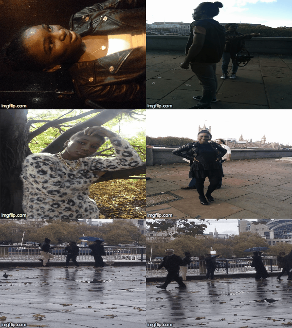
For a small trial I took one of the pictures from our filming session and placed a black and white filter on top along with the artists name to play with how the album may look.
Subscribe to:
Posts (Atom)


