
Showing posts with label Sophie Douglas. Show all posts
Showing posts with label Sophie Douglas. Show all posts
Friday, 23 January 2015
Final Blog
I have learnt a lot in my time at media, from AS to A2 I have so many different skills that I will probably take with me in everything I do. I have loved every part of media, even the deadlines and times where blogging seemed tedious and a waste of time. When I go to uni I will miss every about this subject and I will always remember every experience, disagreement, and will carry them in my heart.


Tuesday, 20 January 2015
Evaluation: Planning Question 3
In the planning of this question I did it a bit different to the rest of my answers, as it is not only asking for what technology I used, it is also asking for what I used in that technology along with why I have don this. I started by listing a few examples of technology I have used in different stages of my project, and after I listed the purposes of those technologies. After doing this I decided to use Camtasia with a voice over in order to show tutorials of how I used the technologies, and what I have learnt from using these technologies. Below are notes I used as a base for my Question 3.


Evaulation: Question Planning 2
In this question it was useful to plan my answer beforehand as it was a bit confusing to think of what examples I wanted to use for what part of the question. Planning has enabled me to gain more clarity in the different sections and titles I wanted to use for my answer. From doing this I realised it would be suitable to display this in the format of a presentation on Slideshare for the majority of the question, this is because I would only need to use pictures as examples. However, I feel it would be better to use this with voki to display the definition of synergy and why it is important as I think these would be two different sections of my answer. Below are the notes I have produced for my answer.


Evaluation: Planning Question 1
Before I started my questions I decided to plan them first so I had an idea of how I wanted to structure my answers before I did this. Planning them first also help me realise want media outlet would best display my work. From planning question 1 I realised that Prezi would be best to display the information as it can show videos, and pictures. This would be good as I can show examples of what I am talking about in my answers through the use of screen shots and camtasia videos. Below is the end result of my planning.


Friday, 16 January 2015


Tuesday, 13 January 2015
Audience Feedback
I create a short video on Adobe Premiere Pro with vox pops of people of my target audience of 16 to 24 year olds. This gave me perspective regarding improvements I need to make to the digipak before the deadline.
Summary
Positive feedback
- They generally thought that the colour scheme complimented the photos
- The digipak included all the necessary information to make it look realistic and professional
- It appealed to them and they would feel comfortable buying the album if it were for sale.
- The picture on my advert didn't really match the photos on my album because on the pose
- The stars for the reviews on the advert were unclear from a distance so they need to be bolder
Saturday, 10 January 2015

Planning Ancillary Work: Number of panels?!
I have decided to use a common 4 panel template for my digipak and in the early stages of the project I wanted to use a template that incorporates a pocket inside my album covers for a lyric booklet. I decided on this after researching the purpose of pockets in albums and also looking at the purpose of a digipak. A digipak is usually to help tell the customers a bit more about the album, the producer and singer within it. This also makes the album look more appealing so it makes the CD look more appealing for customers to buy. I realised that a pocket inside the album covers for a lyric booklet will also serve this purpose as it adds more appeal to the audience if they physically have the lyrics to the song. This appeals to the audience as fans can learn the lyrics to songs and sing along at home or with friends.
However after briefly speaking to my teacher I realised that by including an extra pocket I would creating unnecessary stress for myself as I would have to then create the lyric booklet as well as the album covers and the advertisement. This means that most likely this would be rushed and so I would have produced it at a lower quality than the rest of digipak. Now I have decided I will stick to the traditional 4 panel digipak with the advertisement so I can allow myself enough time for my evaluation questions.
However after briefly speaking to my teacher I realised that by including an extra pocket I would creating unnecessary stress for myself as I would have to then create the lyric booklet as well as the album covers and the advertisement. This means that most likely this would be rushed and so I would have produced it at a lower quality than the rest of digipak. Now I have decided I will stick to the traditional 4 panel digipak with the advertisement so I can allow myself enough time for my evaluation questions.
Planning Ancillary Work: My choice in background
In order to choose the background for my digipak I took inspiration from Katy Perry who is an artist from the pop genre. As my artist will also be from the pop genre. The picture below is her album cover from her album 'Teenage Dream,'

I decided that I would want to take the idea of clouds as inspiration for my digipak. I thought using a soft colour such as baby blue would imitate the fluffy texture of clouds especially when mixed in with the colour white. I had thought about using a using a background from the internet but I first wanted to try creating the background myself so I could do more with it when editing. I found there was a filter on Photoshop called which takes the two colours from the colour picker and blends them together in order to create the appearance of clouds. I found this by going to filters, render and then clouds at the top of the screen.

This is the final result.

Planning Ancillary Work: Digipak Font Shortlist
For the short list of fonts for my digipak I decided on any of the fonts below for the majority of my digpak and the artist name.
.png) Aovel Neo
Aovel Neo.png) Hasteristico
Hasteristico.png) Regencie Light
Regencie Light Trench
However I decided to use a different font for the track list and the title of the album so they stand out. Although the title of the album will still be small the artist name. I decided on the font below for this.
.png) Remachine Script
Remachine ScriptFinally I decided I want to use the font 'Hasteristico' for the majority of my digipak and 'Remachine Script' for the album title and the track list
Friday, 9 January 2015
Today's Lesson: Change in album cover
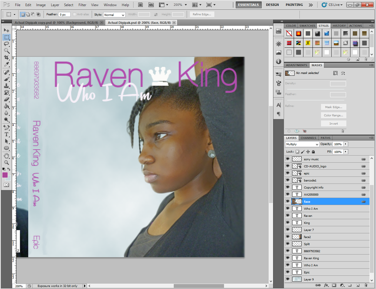
In today's lesson I was reviewing the work I have already done found that I needed to make a minor change to the front of the album, in order to make it look more aesthetically pleasing. I asked someone from my class to look at my initial digipak and tell me what stood out to them and they told me the crown looked as if it was sitting on top of the artist's head which looked a bit funny. This was definitely not the response I was looking for and I decided to change the position and size of the crown so it accentuated the artist name rather than and artist. After doing this I was satisfied with the results as it looked more professional rather than "convenient".


Tuesday, 6 January 2015
Planning Ancillary Work: Shortlist of photos for digipak
We took photos of our artist in our last media last before we had Christmas break. Before this lesson we briefed panned what our artist was gonna wear and because of this we decided we wanted her to wear a dress so it contrasted with the white wall we were going to use. Also this contrast would make it easier to cut her image out in Photoshop. After taking a multitude of photos I decided two photos that I felt would work to follow conventions.


I decided to use this photo for my back album cover as I thought it would add another level to my cover. I also took inspiration or this from one of the photos I use for a early lesson task, where we had to create a digipak adding the correct elements of a digipak to our final design. The photo showed a girl hiding behind a wall, and I was going to have our artist do this during the photo shoot but we had a very small amount of space so we couldn't. So I just decided to take a picture of half our artist's face.


I decided to pick this photo of her sideways for my front alum cover, as I felt I wanted this from the digipak mock up stages. I took inspiration for this from Elle Varner's album, Perfectly Imperfect where in she also has her arm up with her facing sideways which was one of my initial inspirations for my digipak.
I decided to use this photo for my back album cover as I thought it would add another level to my cover. I also took inspiration or this from one of the photos I use for a early lesson task, where we had to create a digipak adding the correct elements of a digipak to our final design. The photo showed a girl hiding behind a wall, and I was going to have our artist do this during the photo shoot but we had a very small amount of space so we couldn't. So I just decided to take a picture of half our artist's face.
Sunday, 21 December 2014
Rough Ancillary Work: Pitch Feeback
After I pitched my original concept for my digipak to my teacher she gave me feedback on how to improve. She enjoyed my idea of an signature image in the artist's name with influences from Ella Eyre and also she liked my colour themes of white, purple and black. Although she was impressed with the amount of though and detail I had put into planning, my teacher explained the problems with my advertisement. I had missed out the artist's name, but also I had put the wrong information at the top. I put the logos of where the album would be sold however they are supposed to be smaller and at the bottom as they are not the focus of the advert. Apart from that they weren't a lot of problems with my ideas and inspirations, but I will definitely use this feedback to improve the quality of my digipak.
Planning for Ancillary Work: Mock up of Advertisement
I took inspiration for what I should include on my advertisement from artists from the pop/ r'n'b genre. Rihanna, Katy Perry, Adele and Delilah feature a smaller version of their album cover in some way on the poster. Delilah however, uses her album cover as the main image on her advert. Her advert also includes reviews from different media outlets such as The Guardian. As well as this, both Adele and Delilah put their record label copyright logos on their poster. The majority of the adverts also include the release date or the words 'out mow', along with the artist's website.


All of this information led me to creating this rough mock up of my advertisement design. If any this has made me realise what not to do, as after pitching my idea to my teacher I realised that I had left out the artist name, album name on the poster. I also messed up the positioning of the different elements as the digital download information should be smaller and at the bottom of the poster as it is not the most important information. From doing this mock up and doing the pitch I now know exactly what I should do for this part of my digipak. In the long run this has enabled me to plan and produce a good quality digipak later in the project.

Subscribe to:
Comments (Atom)